Component library
Every component below is globally registered — use it in any .md/.mdx page with no import line. All styling flows from the design tokens in src/css/tokens.css.
Cards
Clickable navigation cards in a responsive grid:
A clickable card — the whole surface is the link.
Without href, a card is a plain content panel.
<CardGrid>
  <Card title="Getting started" icon="rocket" href="/guides/getting-started/quick-onboard">
    A clickable card — the whole surface is the link.
  </Card>
  <Card title="Static card" icon="package">
    Without `href`, a card is a plain content panel.
  </Card>
</CardGrid>
CardGrid accepts columns={2} to force a fixed column count. icon takes a Lucide icon name from the registry in src/components/Card/icons.tsx — at the time of writing: rocket, book-open, code, puzzle, sliders, key, folder, bell, package, braces, wallet, layers — rendered on a light brand-tinted chip beside the title. The registry file is the authoritative list; add icons by pasting Lucide paths into it. Emojis aren't used.
Figure — image frames
Screenshots get a consistent frame, caption, and click-to-expand lightbox. frame="browser" adds browser chrome; try clicking the image:
<Figure
  src="/img/products/dashboard.png"
  alt="Dashboard with sidebar navigation, stat cards, and an activity chart"
  caption="The dashboard after first sign-in."
  frame="browser"        // 'plain' (default) | 'browser' | 'none'
  zoom                   // click-to-expand lightbox (default true)
  width={720}            // optional max width
/>
Video — video frames
Same framing system for workflow clips. Every player carries a viewer toolbar under the video — subtitles on/off (CC), playback speed (cycles 1× → 1.25× → 1.5× → 2× → 0.75×), download, and full screen — so these work identically in every browser instead of hiding in per-browser menus; pass toolbar={false} to hide it on small hint loops. autoPlay turns a clip into a silent loop — controls stay visible so viewers can pause it (an accessibility requirement for moving content):
<Video
  src="/video/purchases/purchase-invoices.mp4"
  poster="/video/purchases/purchase-invoices.webp"    // npm run record generates all four
  captions="/video/purchases/purchase-invoices.vtt"          // caption track (required)
  chapters="/video/purchases/purchase-invoices.chapters.vtt"  // jump-to menu for long clips
  caption="Recording a purchase invoice."
  frame="browser"          // 'plain' (default) | 'browser' | 'none'
  startAt={3}              // skip an intro: begin at 0:03
  playbackRate={1.25}      // speed up slow walkthroughs
  muted                    // start silent (implied by autoPlay)
  controls={false}         // hide the player bar (default: visible, even with autoPlay)
  toolbar={false}          // hide the CC / speed / download / fullscreen toolbar
  label="Creating a project walkthrough"         // optional accessible name for the player
/>

<Video src="/video/hint.mp4" autoPlay width={480} />
Videos are produced by npm run record (Playwright) and converted to web-ready H.264 by ffmpeg — see Standards.
The say: and chapter: cues you write into a recording flow become the captions and chapters tracks above, so a clip arrives navigable and accessible rather than needing either bolted on later. Captions satisfy WCAG 2.1 §1.2.2 and give the video its only searchable text; chapters are what let a viewer skip to the one step they came for, which is why a long end-to-end walkthrough is preferable to several clipped fragments.
The frame keeps its shape at every window size: the aspect ratio is declared in CSS, so the page reserves the right box before the file's metadata arrives and nothing below the player jumps as it loads.
Carousel — step slideshows
A user-paced step slideshow — the lightweight alternative to Video when a task teaches better as discrete captioned states than as motion. Readers move through the slides with the arrow buttons, the dots, or the ← / → keys; each slide carries its own caption, the current slide announces itself to screen readers, and a counter keeps the position visible:
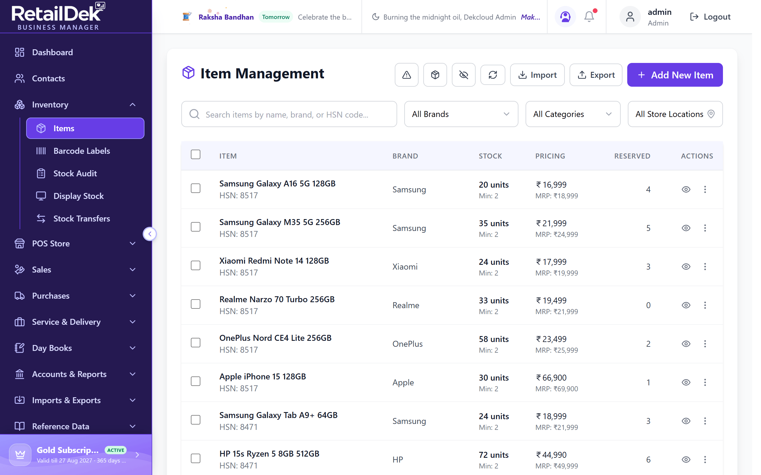
<Carousel
  frame="browser"
  caption="Three ways to reach a page."
  slides={[
    {src: '/img/items/add-item-1.png', alt: 'The Items list with the Add New Item button outlined in blue.', caption: 'Step 1 — Select Add New Item.'},
    {src: '/img/items/add-item-2.png', alt: 'The Add New Item form with the required fields outlined in yellow.', caption: 'Step 2 — Fill the Basic Information fields.'},
  ]}
/>
| Prop | Type | Default | Description |
|---|---|---|---|
slides | array of {src, alt, caption?} | required | Ordered slides, one per step. alt is required on every slide; caption holds the step's instruction. |
frame | 'plain' | 'browser' | 'browser' | 'browser' adds browser chrome around the slide area for app screenshots. |
caption | ReactNode | — | Overall caption under the carousel — what the sequence teaches. |
width | number | string | — | Optional max width. |
An empty slides array renders nothing, and in development a missing alt on any slide logs a console warning. Steps shown in a carousel must also remain self-contained in the surrounding text — see Standards.
Steps
Wrap an ordered list to get numbered circles with a connecting line:
-
In the sidebar, select Inventory, then Items.
-
Select Add New Item.
-
Enter a Name, then select Create.
<Steps>

1. In the sidebar, select **Inventory**, then **Items**.

2. Select **Add New Item**.

</Steps>
Expandable
Collapsible sections for troubleshooting and optional detail — built on native <details>, so it works without JavaScript:
<Expandable title="When should I use Expandable?" open>
  Body content — full Markdown works here.
</Expandable>
Badge
Inline pills for roles, permissions, and feature states:
New Beta Add-on Admin role ACL: items read<Badge variant="admin">Admin role</Badge>
The five variants are new, beta, pro (an entitlement gate), admin (a role gate), and info. The API reference uses admin and info for the permission chips under each endpoint.
API components
ApiEndpoint renders a method badge + path line for REST references:
/api/v1/pursepoliciesReturns an array of purse policy objects./api/v1/pursepoliciesCreates a purse policy./api/v1/pursepolicies/{id}Deletes a purse policy permanently.<ApiEndpoint method="GET" path="/api/v1/pursepolicies">Returns an array of purse policy objects.</ApiEndpoint>
Tabs (Docusaurus built-in, globally registered) hold multi-language samples — groupId syncs the choice across the whole site:
- curl
- Python
curl https://app.retaildek.com/api/items -H "Authorization: Bearer eyJhbGciOi..."
requests.get("https://app.retaildek.com/api/items", headers=headers)
Tables
Plain Markdown tables are styled globally — header fill, zebra stripes, row hover:
| Setting | Default | Description |
|---|---|---|
| Decimals | 0 | Decimal places tracked on a currency balance. |
| Overdraft Limit | 0 | How far a purse balance may go negative. |
| Escrow Duration | None | How long earned points stay pending before they're redeemable. |
Keyboard keys
Use <kbd> anywhere: press Ctrl + K to search.
Diagrams
Mermaid renders from a plain code fence:
Admonitions
Docusaurus callouts, themed by the global tokens:
Prefer :::tip for shortcuts and best practices.
Use :::warning before destructive or irreversible actions.
Page feedback
A slim "Was this page helpful?" row with thumbs-up / thumbs-down buttons appears under every doc page's footer. Unlike the components above, it isn't written into pages — the src/theme/DocItem/Footer wrapper mounts it automatically, so no page ever references it.
The widget is config-gated and hidden by default: it renders only after feedback.endpoint in site.config.ts points at an API endpoint (for example /api/docs-feedback). Each vote POSTs a JSON body of {route, helpful, ts} to that endpoint, then the row swaps to a thank-you message. Votes are remembered per route in the browser's localStorage, so a page never asks the same reader twice. See Configuration for the setting.